

Getting this building done was a pain, which was entirely down to shit planning and organization on my part. At no point was I tempted to chuck it out the window, which is always a good thing, but holy crap it seemed to drag out.
Painting and detailing wasn't helped by having to get a new can of texture paint thanks to my first one ceasing to work, and a power cut that left us in freezing darkness for an entire day during which my laptop, Kindle and phone died one after the other. Happily the electricity came back on before things went a bit Donner Party.
I apologise for the crappy photos, I had to use my phone as my DSLR's battery is charging.

Once power was restored, the building was carted up to the kitchen to be painted. I used a craft paint called Antique Parchment as I wanted an off-white shade, and it worked really well, only needing two coats to cover the primer. The masking tape sticking off the corner was for an idea I had to show the underlying bricks as if the plaster/paint had fallen off with age.
I watered down some homemade black wash and liberally applied it to the walls to shade them. While it dried I got on with painting the window and door frames Red and highlighted them with some Flat Red. The doors got a coat of Plate Metal over Neutral Grey. The roof was done the usual way: Pewter Grey craft paint, homemade wash, then Granite Grey craft paint and some daubs of Sepia and Umber washes.

The whole building was highlighted with White craft paint and the frames were superglued into place. The transparent plastic sheets I'd ordered had shown up, and one was sprayed with matte varnish to kill its shininess and make it look dusty. I measured the windows but decided that just cutting one large strip of plastic to cover each set of windows in one go would be a lot easier, as you can see in the above image. I also painted the insides of the rooms with black craft paint to help hide their emptiness.

With the white sorted, it was time to remove the masking tape and do the exposed bricks. I switched to Vallejo paints, using Terracotta for the basic colour and Heavy Skintone and Dark Grey on some random ones. They were also shaded with homemade black wash and drybrushed/stippled with Ghost Grey.
Once all that was done, I daubed some thinned Sepia Wash randomly onto the walls with a bit of sponge, then painted the base to resemble pavement the same way I did the roof and added some tufts along the edges of the walls.
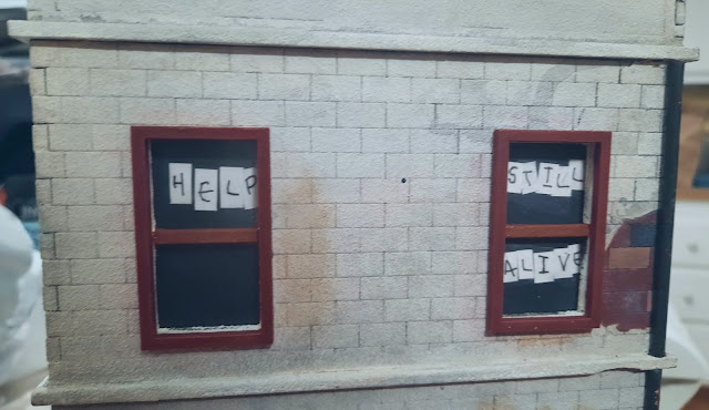
With all the painting done, it was time to move on to the details. I started with some desperate messages on the upper back windows, the idea being that each letter is on a separate piece of printer paper. They're held in place with some matte Mod Podge and look pretty good. The drainpipe to the right is just two lengths of plastic tube sprayed with red-brown primer, dabbed with Liquid Latex and painted Black Grey. The top coat is then rubbed away to reveal the rust underneath, which you can't really see in this terrible cellphone photo.
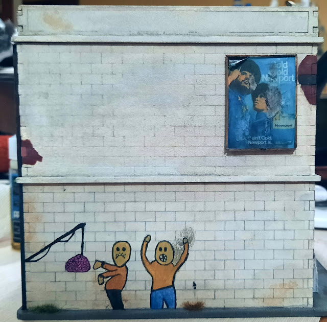
Oh god, graffiti time. I wanted to do something a bit fun and had the idea of a fishing rod with a brain for bait and a couple of zed-heads, so after taking a deep breath I drew the design with a pencil, outlined everything with Black and then filled in the colours. It went a lot better than I thought it would, so yay.
I also thought the top floor needed something and decided on a smaller billboard that you sometimes see on buildings in the UK. I made it the same way I did my large one last year, using foamboard, coffee stirrer sticks and a printed image, in this case a 1970s ad for Newport menthol cigs. The image was weathered by being plastered with black wash and then scraped with an Xacto blade.

The back just got a Cookie Monster and the classic hand-painted NO PARKING sign seen on so many British buildings. I added the DO NOT OPEN to the back door just to give the impression that the building is full of the undead, which believe me it could be on election night.

The right side got these two tags, for want of a better word. They're not my best work but they did fill some space.
You can see on the second floor where there's a rough-looking patch. This was thanks to me spraying way too much texture paint on that area (and some others) because the paint is a colour called Desert Bisque and is damn near identical in shade to the MDF, so it can be difficult to see where the spray ends and the MDF begins. The new paint is grey so hopefully this won't happen again, although it does add to the general scruffiness and run-down look of the building.

The front didn't get any graffiti except the spiky-haired face on the left, which I try to add to all my buildings as I can draw it easily with a Micron pen. The two news boxes to the left are casts I made using Oyumaru and Milliput as I only have one original TTCombat resin box left. You can barely see it, but the large window on the lower right has a splat of Blood for the Blood God sprayed up the inside to add some horror.
The windows are bereft of details because I cannot for the life of me think of what to put in the window of a local paper as I always worked in actual office blocks. I haven't glued the second floor to the first floor yet, so I can remove it to add something when I get an idea. Maybe some posters of local events?
The Chronicle sign is just a printout which is stuck to a piece of foamboard and literally jammed into the gap. It's too clean so it'll get some black or Sepia wash daubed onto it at some point. I had a major internal debate about the font to use for the sign as I cannot stand the Olde English fonts used for newspaper mastheads and wanted to go with a modern sans display typeface, but after going through about a million I decided to stick with tradition for the sake of actually getting it done.
So that's one of my birthday buildings done, the other is about 95% finished and there'll be a post on it soon!
Classifieds, for sale ads, wanted ads etc. those little cards news agencies also feature in their windows, or at least did when we were young.
ReplyDeleteLove the overall finished piece tho mate! Exposed brick and all of the other details really look so good!
You must have the better part of a Main Street now? Do you have a nice tarmac road to go in front of it?
Yes, classifieds or wanted ads would be perfect. Thanks, Dai! I'll get on with knocking some up and sticking them into the windows. I have four buildings now, with one more being worked on. No road but I do have a gaming mat :-)
DeleteI love it! That is brilliant all the details you've added really bring it to life mate, especially the signs in the back windows! (I don't hold out much hope for them though 😉).
ReplyDeleteCheers Roger.
Thanks, Roger! I think it's safe to say that the poor buggers who put up those signs are long eaten LOL! I do love adding little details like those, they really bring the models to life.
DeleteExcellent work Matt, every brick, nick and extra detail tells a story, giving the whole piece life and character.
ReplyDeleteCheers, Dave! Adding character to a building really helps it tell a story without words.
DeleteJust another in a long line of fascinating MDF buildings, Matt, which you've done a top job with. You're really tempting me with these - albeit I heavily invested in cardboard "Battle Systems" stuff many years ago now. Would love to see them all set up alongside one another at some point.
ReplyDeleteThanks, Simon! They really are good models, you can add as much detail as you want to them, and they're reasonably priced. I will line them all up soon once the last one is done :-)
DeleteWell done making what in my eyes was an interesting builing into something even more interesting. The plaster falling off effect showing the bricks underneath was a great idea and worth the effort imho. All the graffiti and 'extras' add to the overall look of the model and what's wrong with "The Chronicle" - it's my local paper !
ReplyDeleteCheers, Joe! The plaster effect was a real shot in the dark, I had no idea if it would work but it did. As for The Chronicle, I just wanted something that could be the name of a British or American paper :-)
DeleteWhile reading this, I just realized that I assumed because you live in the States, you would be making a town here and not across the pond. If you were making a British town, then I can't give you stick for having a newsagent after all! :) With that said, I love the graffiti once again which is no surprise. The sign of people still being alive really is nice too. Your terrain is going to look so nice if you do any gaming with it and put it all together. You should have an awesome looking table one of these days with a lot of vibrancy and life to them (which is a bit ironic I suppose)! :)
ReplyDeleteThanks, Jeff! I'm trying for a sort of crossover look, with influences from the US and UK and no particular time setting, hence the posters from the 70s/80s/90s. Glad to see it's working :-) I am planning on doing a game using the scenery, I just have to get the last buildings finished.
Delete