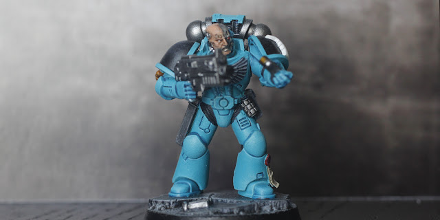
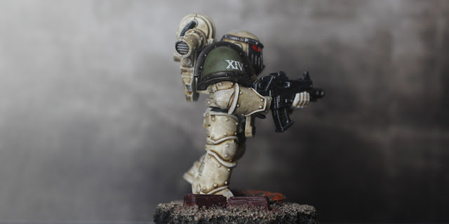
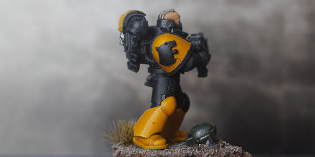
Here's three more of the Emperor's finest: from left, Marines of the Void Dragons, Death Guard and Tiger Claws.
I'm not exactly sure where I go the idea for the Void Dragons. I have a feeling I got a couple of Chapter colour schemes and names mixed up and ended up inadvertently creating my own. This is another model from the Space Marine Heroes range, as is my Mortifactor. I swapped out his head for one I picked up on eBay. I do like the way he's about to slam a fresh magazine into his boltgun.
He's painted with Vallejo Blue-Green and shaded with Amy Painter Blue Tone. Looking at him now, there's not really enough highlighting on the armour. I should have taken it up a couple more stages. But the colour is great, and he stands out against the usual red/blue/black.
I have no idea why there's a bolter shell hanging off his
Oh look, he also has a bloody purity seal. I think the Empire is now giving them out just for showing up. The insignia is another 3D printed one from Shapeways. The eagle-eyed among you might spot that it's for the Black Dragons chapter, which is probably why I got a bit confused over the name.
The Death Guard were one of the original
I used another decal for the skull emblem and just scraped bits off to add to the worn look of the armour. I kept the highlighting to a minimum as I wanted all of his armour to look worn and dirty, which is totally Death Guard; they were sent into the literally dirtiest environments and kept their armour filthy as a sign of their toughness.
He's based on — you guessed it — cork, with some rust-painted bits of plastic to add detail.
At some point they were given a new black and yellow look, which is pretty eye-catching and to be honest is one of the best Marine liveries. Alas, the Tiger Claws are now renegades, having spurned the Emperor's light to frolic in the Eye of Terror.
Yellow can be an absolute sod to paint, but luckily I found a tutorial showing an easy way to do it: a basecoat of Vallejo Filthy Brown followed by glazes of Transparent Yellow. The more layers of glaze, the brighter the yellow, and as I wanted a slightly darker tint I just did two. I used a 3D printed emblem for the tiger head, which I've just realised is on the wrong shoulder pad.
The helmeted skull on the COOOORRRRK! base is another bit from Ebay, and the Roman numerals are (obviously) a decal. The black armour was given a light drybrushing of Army Painter Uniform Grey to bring out some of the details. This is one of my fave Marines as the colour scheme is so awesome.
More space knights coming soon!
Vol. 1 is here.
Vol. 2 is here.


Great work on all your marines Matt, the bullet on the pauldron is a symbol of marksmenship, with the old lore saying the casing was made from a shard from the Emperor's armour, that he wore in his battle with Horus, but that's probably changed over the years.
ReplyDeleteRemember the Tiger Claws who are now the Red Corsairs, unless they've changed that as well ! LOL
Thanks, Dave! I just checked and the Tiger Claws have been folded into the Red Corsairs.
DeleteI didn't know about the bolter shell being an award; I honestly thought it was another case of GW just slapping random bits on their minis.
When I started in 40K it had a lot more background, which has been streamlined and changed multiple times, through all it's changes and rules revisions. Having stopped reading the rules and codexes a couple of editions ago, I no longer am up to date with all the latest lore.
DeleteIt's like the squares that you used to see on the marine legs, they were mag locks for securing weapons and equipment to quickly
I started 40k back in 1989/90, the Rogue Trader era. I do like the newer models (but I'm not that keen on Primaris Marines) but the amount of fiddly detail on them now is a pain... just when you think you're done you realise you missed a skull or purity seal. And it does crack me up to see Imperial Marines sporting more skulls on their armour than Khorne renegades.
DeleteThe maglock thing is interesting; I've seen those mentioned in 40k novels but didn't realise they're actually moulded in the figures. That's the kind of detailing I like.
What I know about Space Marine lore you could write in a matchbox, but IK do know those are really nicely painted, I think I like the Death Guard one the best, love that "grundgy" look.
ReplyDeleteCheers Roger.
Cheers! The Death Guard Marine is one of my faves too. I also like how painters are going for the dirty/damaged/battered look with Marines as opposed to the pristine look of a few years back.
DeleteStrong colors on all three. I may have to try that yellow trick, because yellow is my paint color nemesis. Agree with Roger on the Death Guard. Great work on a classic miniature! I have a "pristine" Ultramarine army, and I also have a "Pristine" Mordian Iron Guard (which actually makes sense, as they do battle in their dress uniforms). It was fine when I painted them back in the 90's; but, at least in the case of the Ultramarines, I would opt for the grungy look if I had to do it all again.
ReplyDeleteThanks Keith! The yellow trick is amazingly simple. The tutorial I found was for painting Imperial Fist Marines, so the guy put four or five layers of glaze on. It works really well and is easy to do; you just have to remember to do the shading/highlighting before glazing.
DeleteA bit of grunge and battle damage never hurts when painting Marines :-)