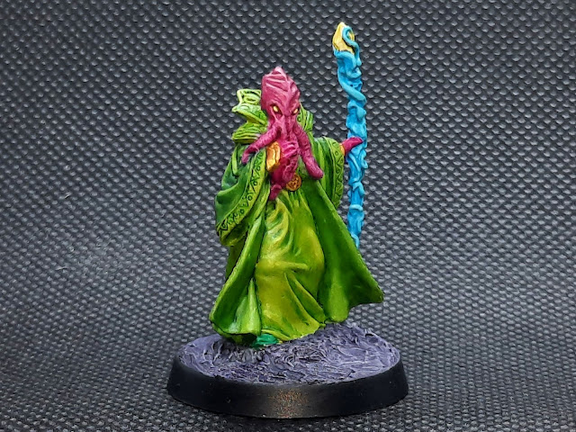
I named him Zoidberg for obvious reasons. After googling around, it appears that a Bathalian is Reaper's non-union Mexican equivalent of D&D Illithids, or mind flayers. I'm almost 99% sure that I got him to qualify for free shipping on Amazon.
I didn't like the violet, so I overpainted it with Heavy Black Green and then gave that two coats of thinned Olive Green. I did his robe, cuffs and collar in Golden Olive, and then washed all the greens with Biel-Tan. To highlight the clothes I just added Yellow Green to the paints and layered it on, but I don't think the layering worked too well.
I attempted to pick out the pattern on Zoidberg's cuffs and collar with more Biel-Tan, and it sort of went OK. His single visible shoe is Park Flat Green.
The final two bits were his eyes, painted Moon Stone, and the crystal on the top of his staff. I just gave it a coat of White and then two coats of Lamenters Yellow layer paint.
Zoidberg's base is a testament to my laziness: it's just modelling paste built up to the level of his integral base, painted Mechanicus Standard Grey and highlighted with Ghost Grey. I jazzed it up a bit with a wash of Druchii Violet.
For a throwaway mini Zoidberg turned out pretty well, especially as the green was a bit of a bugger. The photos were taken using the lightbox, this time with the black backdrop and with my phone instead of my DSLR. I think they came out OK.


Excellent work, Matt. I think the green robe has turned out very well, and nicely contrasts with the Mindflayer's skin tone. Need to crank open my lightbox, but I've still got a few more AHPC postings to go beforehand - where I've already taken the photos.
ReplyDeleteThanks, Simon! The pink, green, yellow and blue go well together and look suitably alien. Have fun with the lightbox, I'm still playing around with mine to find the best distance/lens to shoot with.
DeleteGreat work Matt, changing the robe colour was a good call, especially with the skin tone you've gone with. I['m guessing he's one of those bendy plastic sculpts, with his banana staff, but you've done a great job on the painting.
ReplyDeleteCheers, Dave! The violet would have complemented the pink skin really well, but I just didn't fancy going in that direction so switched to bright green instead. And well spotted, he is indeed a plastic Bones mini and I forgot to mention his bendy staff LOL! I didn't even bother to try straightening it as past experience has taught me there's no point.
DeleteLove him! I've often wondered what Reaper's plans were for the Bathalians, Bakarathi and Andromedans...there are only a handful of each released, and some of them are quite old. Maybe they have or had pans for a game?
ReplyDeleteThanks, Keith! Yeah, I wonder what Reaper was thinking of doing with those minis, but I guess they're just their versions of D&D monsters or generic aliens. I have another Bathalian to paint but I'm keeping it for Monster Mayhem :-)
DeleteI LOVE me some Mind Flayers, easily my all time fav DnD badguys.
ReplyDeleteLove the colour choices on this bloke. Nicely done Mat.
Have a version of this fellow in my own collection and used him in a campaign as a serious badguy who's manipulations made the players' time very difficult.
Cheers, Dai! I do like the look of these guys and I might get more.
DeleteI immediately thought "Mind Flayer", a memeory from my DnD days and happily enough it does pass for one. That green robe really fits the figure well imho and the contrasting staff really makes the whole thing 'pop'.
ReplyDeleteThanks, Joe, the bright colours worked out so well after originally going darker. And bright green isn't used too much so he does stand out!
DeleteI really like the bright and bold colors you chose for this guy. It somehow makes him look even more evil and dangerous which is counter intuitive to me anyway :) This sculpt looks challenging as many of the details are soft and then there's the the bendy staff... Having said that, I think you did very well with it!
ReplyDeleteBendy staffs/swords are the nemesis of Bones plastic, Jeff LOL! I didn't even try to straighten it out, it's never worth the effort. The rest of the sculpt has pretty decent detail which was easyish to pick out, so it wasn't too much of a challenge.
DeleteLove the colours you've used here, looks wonderfully alien.
ReplyDeleteCheers Roger.
Thanks, Roger! The bright colours were a way better choice than going dark.
Delete