Of all the Cthulhu: Death May Die minis, Hastur is by far the creepiest. He was also by far the hardest one to paint.
Hastur was the final large model I painted, or at least tried to paint, for last year's Monster May(hem). It really didn't work out; the colour I used for his tentacles, Malefic Flesh, looks good in small areas but just became a mass of brown-tan on such a bigger model. His cloak was a disaster, endless coats of Demonic Yellow doing next to nothing to cover the black primer. So, I admitted defeat and Hastur went back into storage, and by "storage" I mean "chucked on a shelf".
Twelve months later, Monster May(hem) 2022 has given me the impetus to get this evil sod finished. And I did it, I defeated an Elder God and didn't go insane in the process.
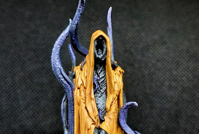
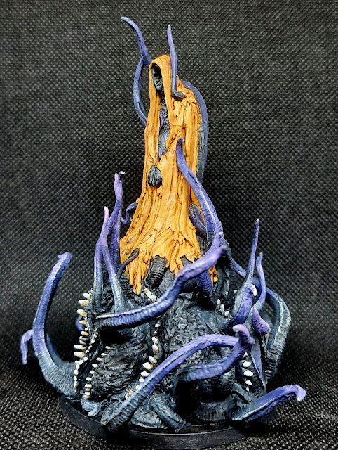
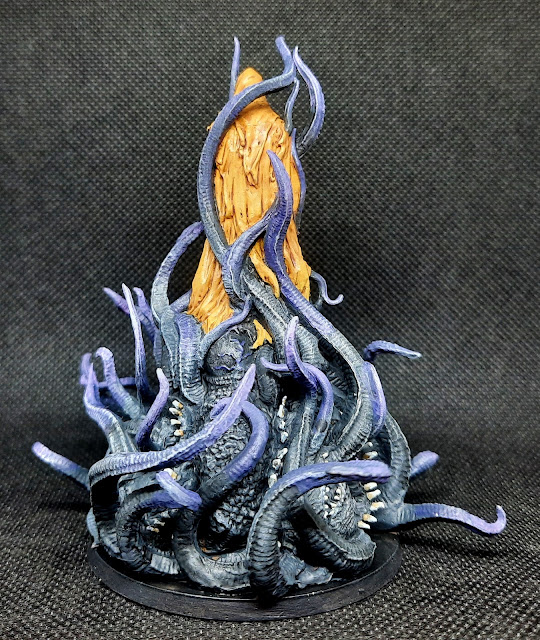
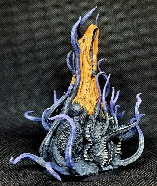
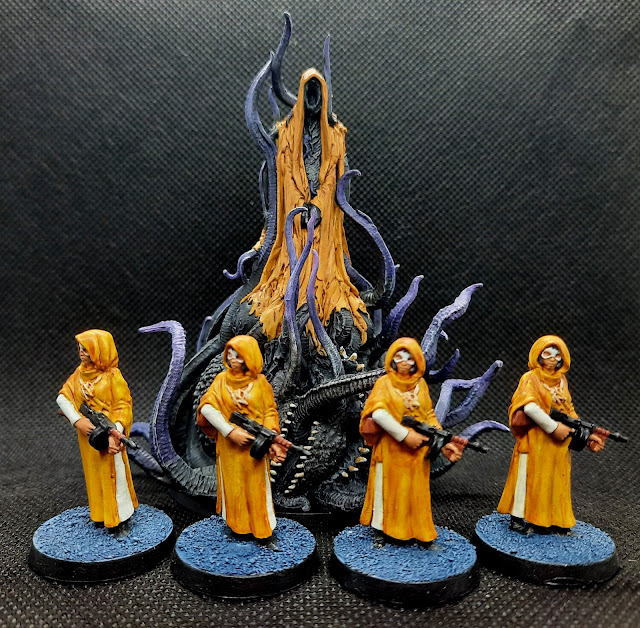
The first thing to do was the mass of writhing tentacles and toothy scrotums that make up Hastur's... body? I painted over all the Malefic Flesh with Black-Grey, shaded it with Nuln Oil, and then highlighted it with Mechanicus Standard Grey and a touch of Neutral Grey. It looked way, way better than the old colour.
I wanted to add another colour to break up all the black, so I layered some Violet onto the ends of the tentacles and then layered Pink over that. Although Hastur is usually portrayed as being solid black, it's such a bloody boring colour and the layering helped disguise some of the chalkiness of the drybrushing.
So here's a sentence I never thought I'd write: Thank you, Games Workshop. Averland Sunset has been a gift from the Dark Gods when it comes to painting yellow; it's a solid colour, it covers really well and it's an excellent base for other yellows. Two thin coats were all it took to obliterate the Demonic Yellow and leave him looking more like a model that was painted by someone who knows what he's doing.
With the base yellow done, the cloak got a wash of Seraphim Sepia but it didn't do enough, so a second wash was called for. I wasn't just trying to shade the fabric, I also wanted to give the impression that Hastur isn't a fan of washing machines.
Once I'd achieved the shaded and dirty look I was going for, I used thinned Averland Sunset to highlight the cloak's edges.
Here's Hastur with his small group of female cultists, which I painted last December. These look a bit different because I used contrast paints for their robes, but they work when paired with their dark master.
Stay tuned for more monsters!


Hastur looks great with his minions gathered! That mini does look like a pain to paint with how tall it is and also with plenty of hard to reach places. I think it came out nicely and Hastur was worth painting for the title of this post alone in my book! :D
ReplyDeleteThanks, Jeff! Hastur was a pain to paint and not just because of the yellow; there are some really awkward spots to reach with the brush. And it's nice to know my headline writing magic is still with me LOL!
DeleteExcellent work on Hastur Matt, the choice of colours you've gone for work well together and add interest points around the model, with the yellow drawing you in to the central point
ReplyDeleteCheers, Dave, adding some colour to the grey tentacles really helped give it a bit of extra colour.
DeleteAnother blasphemous entry (and entity) this year...I knew you couldn't stay away from the Mythos! Hastur is one of my favorite Elder Gods, due in large part to the King in Yellow avatar. This looks great!
ReplyDeleteOne of the things I lament strongly about GW changing their paint line every few years is that old, good colors get replaced by new, shitty ones. I'm a big fan of the old Tausept Ochre as a foundation for yellow. It was solid and thick enough to cover anything. Nowadays, a trick I use is to do an undercoat of grey under whatever is going to be yellow and build up from there.
Yeah, my whole "no Lovecraft monsters this year" thing didn't last long LOL! And I have another one to come! I've heard about grey being a good base for yellow but I've never tried it; maybe I should at some point.
DeleteNice work mate. He looks suitably disgusting (in a good way), I think the grey/black looks great on his squishy bits (sic) and the yellow (sod of a colour) looks great too, glad you were able to bring yourself to try and get him finished, not always easy once you you put something to the side.
ReplyDeleteCheers Roger.
"Disgusting" is the look I was going for so it's nice to know I achieved it :-) And you're right, going back to an old part-painted model is always hard so I'm happy I did it and got him finished.
DeleteFreaky looking bugger for sure! O_o The Cthulhu Mythos is a very strange place.
ReplyDeleteExcellent paintwork Matt. That yellow is smashing indeed.
"Freaky" is certainly one way of putting it, Dai! The yellow worked so well I was shocked, I just wish I'd had some Averland Sunset last year :-)
DeleteLooking good Matt.
ReplyDeleteI'm not looking forward to painting this one myself, though I've yet to start on any of the games minis so it could be a while yet.
Yellow is never easy and he looks damn fine to me and I think the colours you've used on the tentacles work really with it.
Thanks, Justin! This one is by far the hardest to paint, it has lots of areas that are difficult to get at and it's easy to accidentally rub paint off the tentacles as you handle it. But it's well worth it, it's an amazing sculpt.
Delete